CASE STUDY
BRAND & WEBSITE REDESIGN: ELDER LAW FIRM
Their Story
Elder Law of Nashville approached our design agency seeking a comprehensive brand and website redesign. The firm specializes in providing legal services tailored to the unique needs of older individuals and their families. However, their existing brand identity and website did not effectively convey their expertise or provide the best user experience (UX).

Result Highlight:
The modernized brand identity and user-centric website have not only improved the firm’s online presence but also contributed to increased client acquisition and retention.

What it means:
The professional appearance now accurately represents the firm’s commitment to providing high-quality legal services.
Challenge
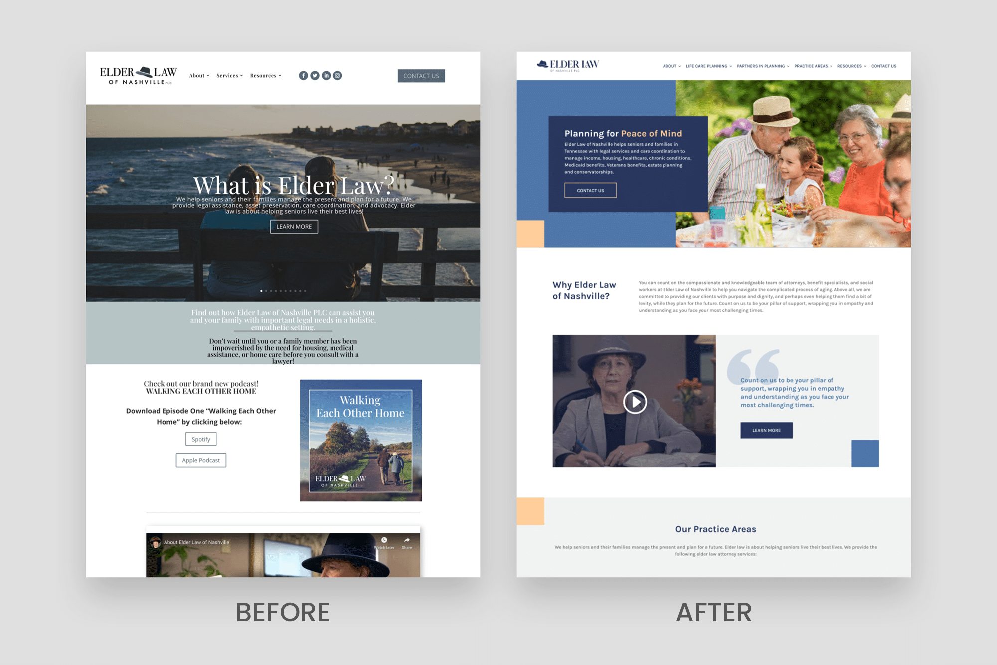
Elder Law encountered a dual challenge involving an outdated brand image and an ineffective website. The existing brand, while well-established, fell short in conveying the level of professionalism and trustworthiness crucial in the legal realm, particularly within the sensitive field of elder law. The website presented difficulties with navigation, outdated content, and lacked user-friendliness, resulting in a higher bounce rate as potential clients faced challenges finding information.
Compounding these issues was a missed opportunity to spotlight the firm’s extensive expertise in elder law. Despite considerable knowledge and experience, the firm had not effectively communicated these strengths, leading to missed connections with clients seeking specialized legal assistance. Recognizing the need for a transformation, the firm embarked on a strategic journey to revamp its brand and website. The objective was to not only enhance the aesthetic appeal but also improve the usability of the website, ensuring a seamless experience for visitors while showcasing the firm’s wealth of expertise in a clear and accessible manner.
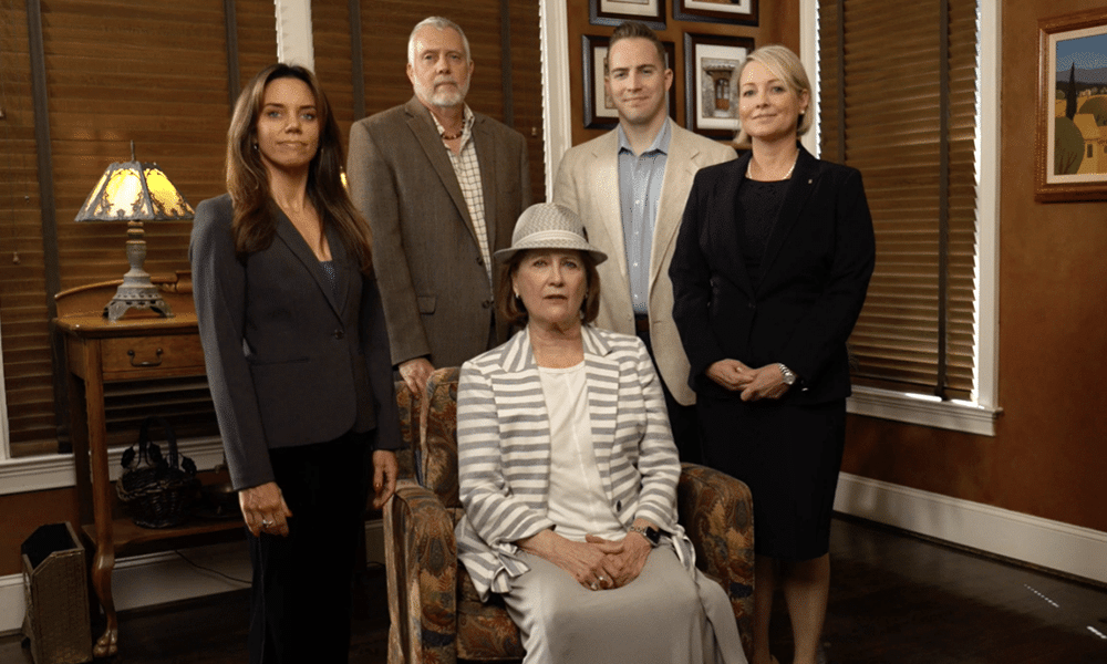
By aligning Elder Law’s brand presence with its core values established trust and credibility in a competitive market. The new user-centric website has not only improved their online presence but also contributed to increased client acquisition and retention.
Solution
Our team delved into a comprehensive analysis of the firm’s core values, mission, and target audience, laying the groundwork for a brand overhaul.
We collaborated on the following:
-
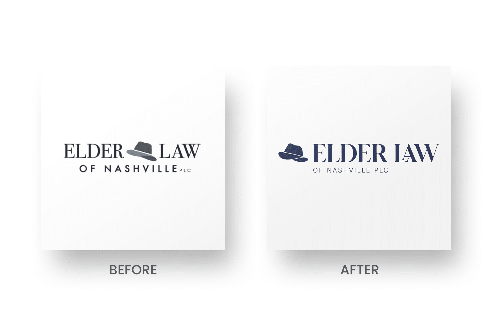
- Designed a modern and professional logo
- Refreshed the color palette, instilling a sense of reliability and compassion
- Designed a brand guide to help boost brand consistency
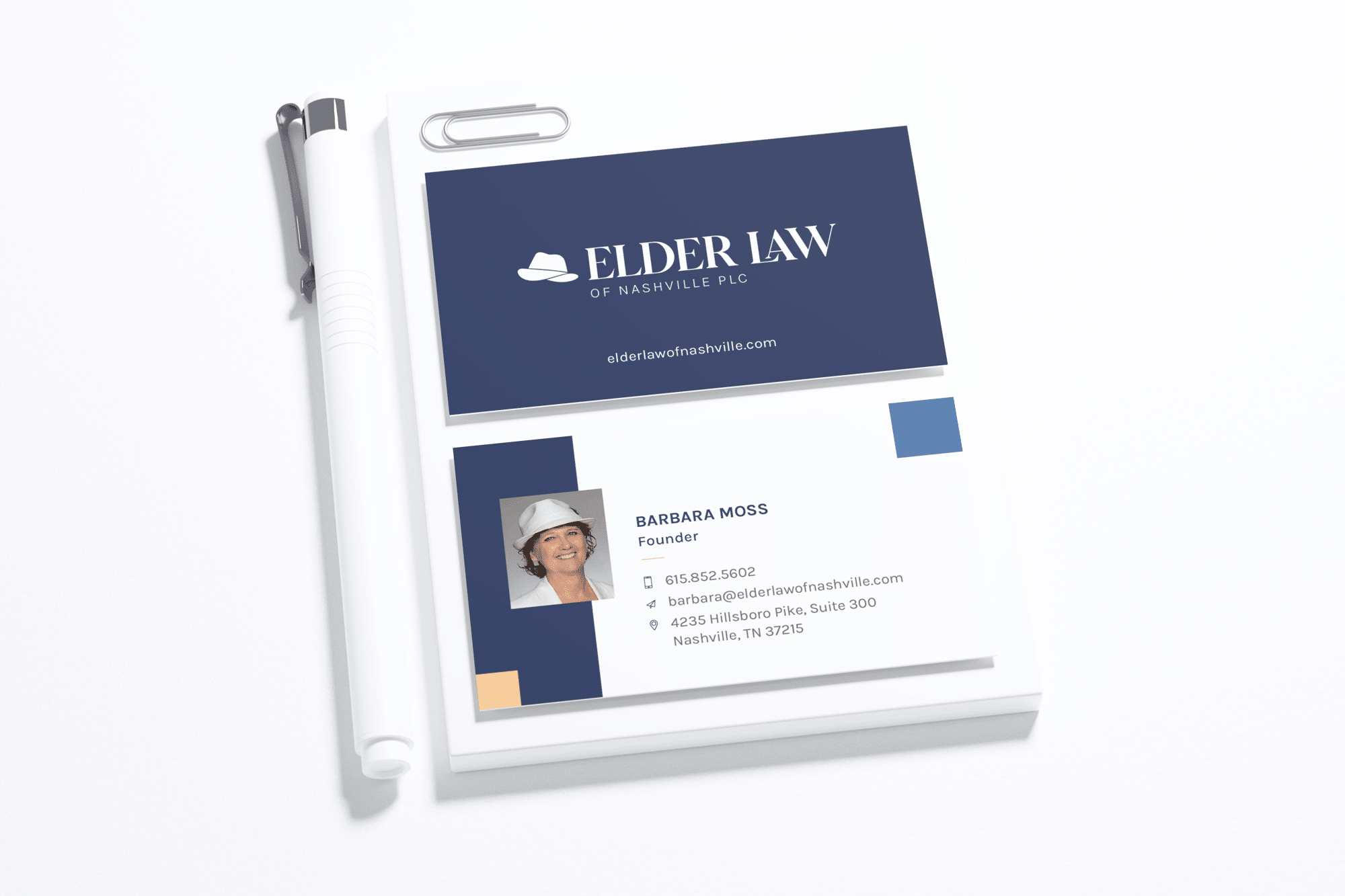
- Created new business cards
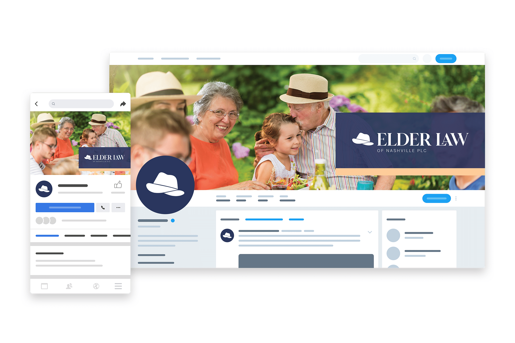
- Updated the visuals on their social accounts
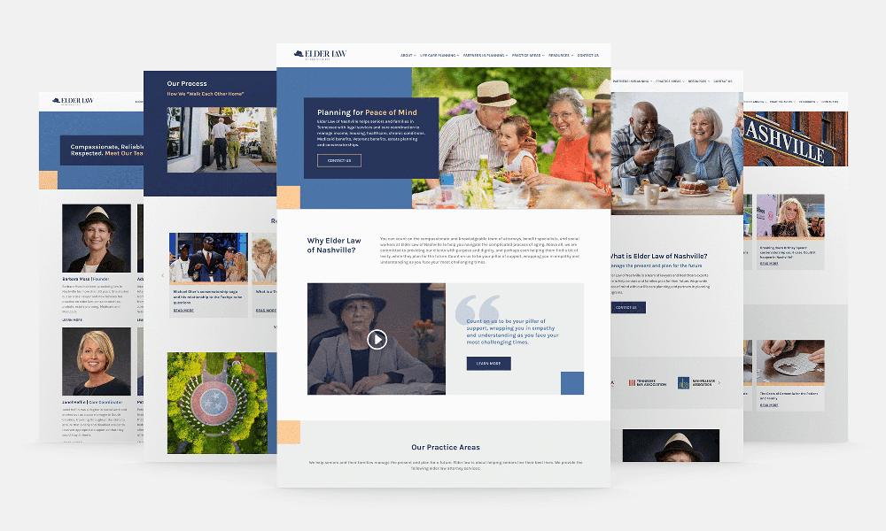
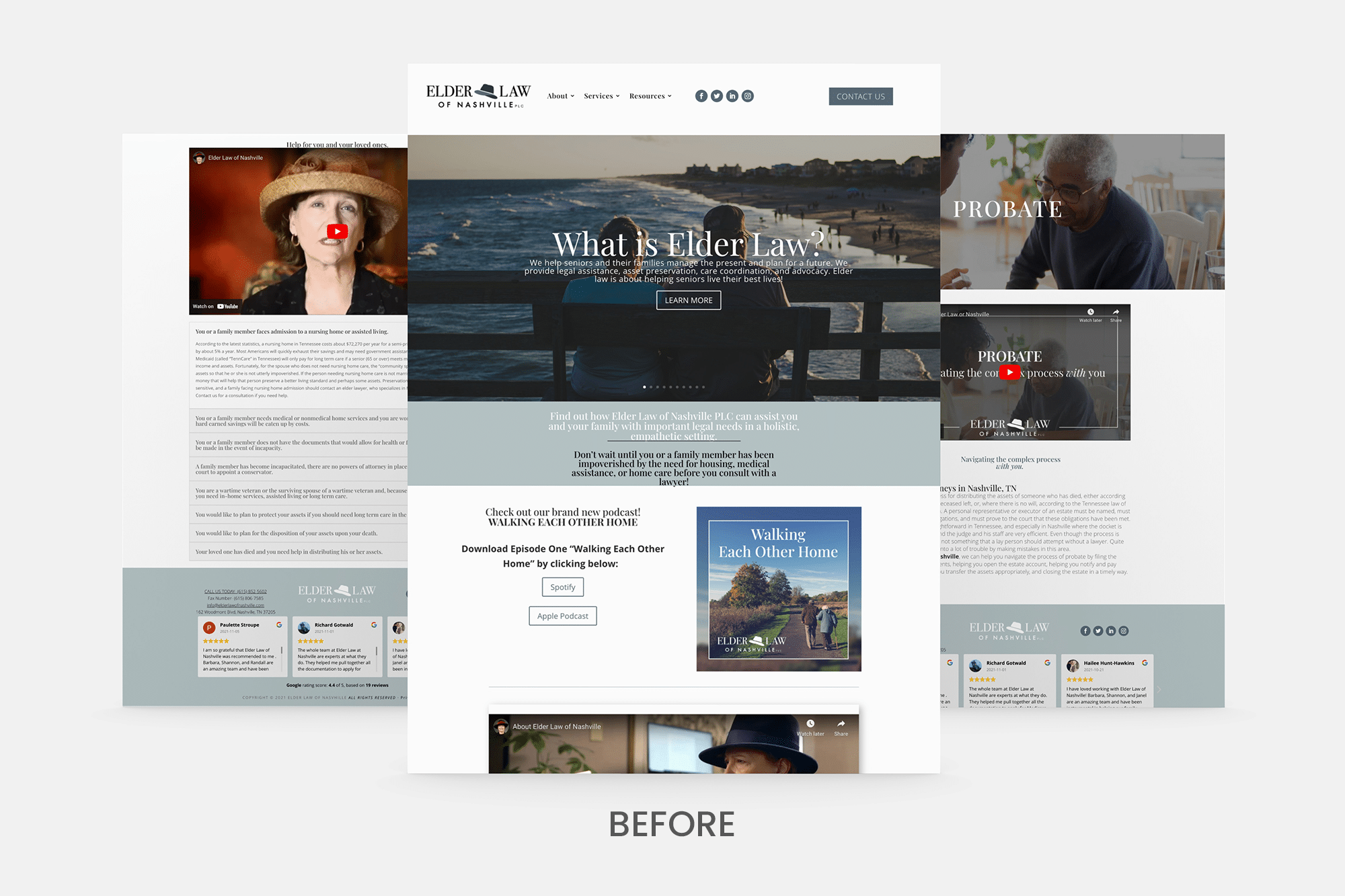
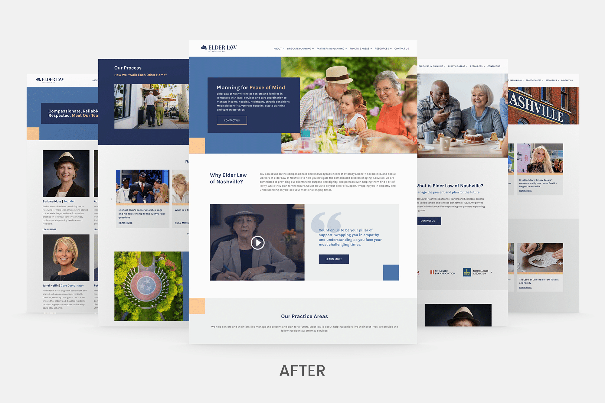
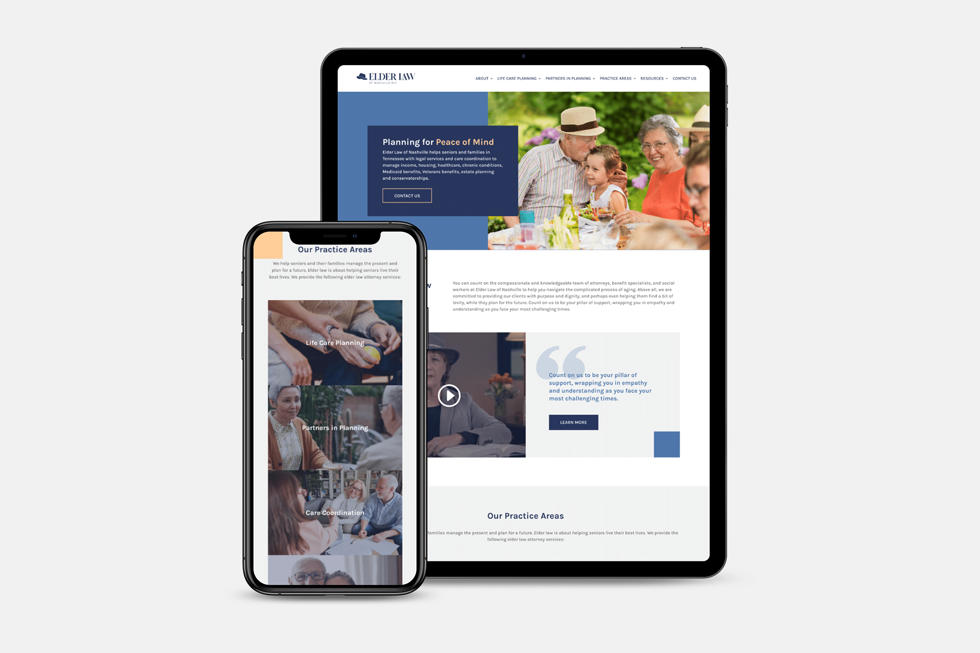
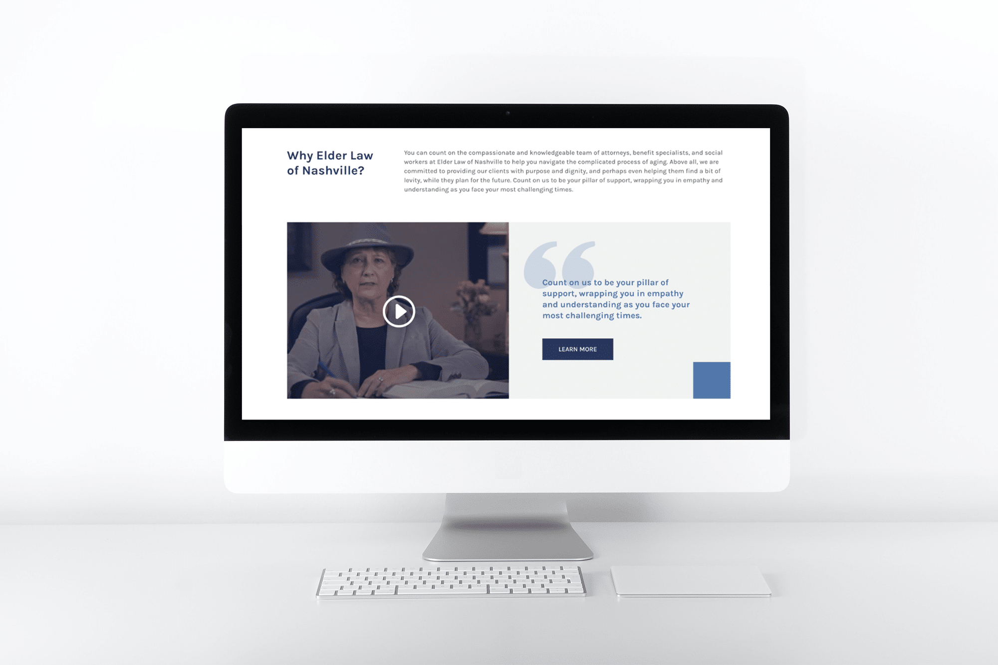
- Website underwent a design and strategic revamp, prioritizing an enhanced user-experience, a clear and intuitive navigation, seamless access to relevant information, and responsiveness across various devices
- Reworked blog content to make sure it was SEO rich
- Carried over new and old media to the site for easy access
- Designed a monthly email newsletter for their team

Results
Improved Brand Perception
The redesigned brand identity received positive feedback from clients and stakeholders, enhancing the firm’s overall image. The professional appearance now accurately represents the firm’s commitment to providing high-quality legal services.
Increased Website Engagement
User engagement on the website significantly increased after the redesign. Visitors now spend more time exploring the content, leading to a reduction in bounce rates. The intuitive navigation and responsive design have contributed to an enhanced user experience.
Client Acquisition and Retention
The revamped website, coupled with an effective content strategy, has attracted a broader audience. The firm has reported an increase in new client inquiries, and existing clients have expressed satisfaction with the improved accessibility of information.


Proof’s in the Results
Check out success stories from businesses we’ve helped grow. Yours could be next!
