We’ve heard it before: you built a great website, created helpful content that (you think) is working and ensured everything is well-optimized and search engine friendly. But…you’re hearing crickets when it comes to leads and can’t seem to figure out where to place the problem.
Let’s face it. A lot of work goes into creating a website design and marketing strategy that meets the needs of your audience, and a well-tuned website for lead conversions is just another piece of the puzzle. Even if your website is performing well in search engines and receiving qualified traffic, you may find that you’re not converting visitors. In this case, there are strategic tactics that you can implement to increase conversions.
Here’s what it takes to maximize the number of website visitors you convert into qualified leads.
What is a Conversion?
First things first, let’s define what a conversion is. This definition will vary depending on your industry, goals and market, but can be easily defined as the number of website visitors that complete a desired action, whether it be a product or service purchase, event sign-up, free trial, product demo, etc. Conversions are unique between each website.
A conversion may single-handedly be the most important metric that is tracked on your website and it can dictate the strategy of your overall digital marketing plan.
Conversion Optimization for B2B vs. B2C
There are different considerations that go into optimizing conversions for B2B organizations versus B2C. For example, typically B2B offerings:
- Are at a higher purchase price than B2C
- Are in a longer sales cycle and require more consideration than B2C
- Involve more people to make a buying decision (and therefore, a more complex buying process)
As such, for B2B conversion optimization, it’s all about building meaningful, trusting relationships with your audience. Let’s continue on to learn the tactics that will close and convert more quality leads.
Conversion Optimization Tactic #1: Personalize Content to Each Buyer Persona (Awareness Stage)
We’ve talked about the importance of creating buyer personas for lead generation in the past. Now that you’ve developed these fictional representations of your ideal customer, it is time to implement what they’re here for: offering a solution to their problem with a message that resonates directly with them.
Here are ways to personalize your content for conversions:
- Website Content: As a B2B company, it’s critical to address the needs of your visitors quickly and effectively. There are many ways to personalize website content by adjusting the calls-to-action, content offers and messaging displayed on your site. For example, you can tailor the content on your site so it speaks to each buyer persona. Consider segmenting your content by your buyer persona’ industry, role at the company, location, pain point, etc. Uncover what keeps your persona up at night and speak to the solution you can offer them.
- Landing Pages: the more your landing page aligns with your buyer’s persona, the more likely they are to convert. In fact, Insight states that personalized landing pages convert four times more visitors than landing pages that target everyone, or that are “un-personalized.” You can personalize your landing page based on the source, industry and location of your buyer persona. Not only will you be delivering a personalized experience to your audience that will address them directly, but you’ll also be weaving in important SEO keywords that will help them find you through organic search.
- Email: if you’re not leveraging a tailored email campaign to reach your audience, you are simply missing out! If you’re a HubSpot user, you can easily create dynamic lists of each persona that can be used for targeted email sends. These segmented email sends can be based on the recipients’ company, industry, role, problem and even their browsing history, or what pages of your website they have visited.
A recent Salesforce report found that 76 percent of consumers expect companies to understand their needs and expectations. What better way to show that your company understands their needs and pain points than creating helpful content that truly speaks to them. When content personalization meets the B2B sales funnel, great things can happen!
Key Takeaway: To speak to your audience, you must know who they are, what keeps them up at night and how your solution can help. Once you define who your buyer personas are, let this information guide your content strategy.
Conversion Optimization Tactic #2: Test Your Call-to-Actions (Awareness Stage)
This is a simple tactic that packs powerful results. It’s hard to remove yourself from your B2B website to view it with fresh eyes, but try to imagine that it is your first time visiting the site. Is it clear where visitors should go along the conversion path? Is there an intuitive next step on every site page? The last thing you want is your visitors to stop dead in their tracks, craving more information, but are not sure where to find it.
Ensure there is a well-defined conversion path for website visitors to travel through by adding attention-grabbing, relevant call-to-action buttons. To effectively test call-to-action buttons, make sure to:
- Analyze and Document Current Data: you don’t know where you’re going until you know where you’ve been. Keep track of your website’s call-to-action conversion rates and click rates. Now you’ll have some solid data to analyze after your call-to-action is A/B tested.
- Make an Educated Optimization: based on your buyer persona, current data and call-to-action button, what do you think should be improved? Some optimization factors to consider:
- Does the color of the call-to-action button blend into the site page and go unnoticed? It should pop!
- Is the call-to-action above-the-fold (visible on the initial page load)?
- Does your call-to-action convey what the offer is? It should use active phrases like “Download Now!”, “Sign-Up”, “Request Demo”, etc. Avoid undescriptive call-to-action text, such as “Submit” or the dreaded “Click Here.” Entice them with why they should visit the landing page.
- Test One Element at a Time: Each tested variable deserves it’s own A/B test. This way, you’re sure which element was responsible for an increase or decrease in conversion rates and click rates.
- Let the Best Call-to-Action Win!: A/B testing sends half of your visitors to call-to-action A and half of your website visitors to call-to-action B. Whichever of the two versions converts the best, wins.
Key Takeaway: Guide website visitors through the marketing funnel with smart calls-to-action that are tested for optimum performance.
Conversion Optimization Tactic #3: Create Credibility and Credence (Consideration Stage)
Online visitors are discerning. They carefully conduct research before making a purchase decision and want to know what to expect before engaging with a business. In fact, a report by Forrester finds that 68% of B2B buyers conduct research online before making a business purchase. This means that you need to have content that backs up your claims as a business to establish trust with potential buyers.
Credibility and trust can come in many forms. For B2B businesses, a few include:
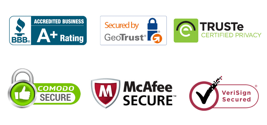
- Security Badges: these badges establish confidence, especially where B2B business is concerned. It shows that your business is authenticated by a third-party and their information is secure. Below are security badges you can consider adding to your website if it’s been verified.

- Awards: Capitalize on your success! Highlighting the awards you’ve won shows that you are a respected business with noteworthy achievements. Industry awards create buzz for your business and make you stand out from the competitors.
- Customer Testimonials: Like an award, testimonials provide the “don’t take our word for it…” messaging that connects potential customers to your business. A well-written, real customer testimonial will help validate your service offerings and provide the proof that leads need to make their purchasing decision.
- Case Studies: Instead of telling prospective buyers how amazing your product or service is, show them with quantifiable data. AWAI reports that 73% of B2B marketers publish case studies in order to establish trust and nurture prospects through the consideration phase. If you’re not marketing effective case studies on your website, the chances are, your competitor is.
- Satisfaction Guarantee: Help leads feel even better about making a purchase from you by adding a satisfaction guarantee. The truth is, making an online purchase will always carry a certain amount of risk for customers. Minimize their perceived level of risk by promising them to deliver on their expectations.
Each of these tactics will establish credibility for your B2B business and encourage conversions.
Key Takeaway: B2B buyers are savvy, and want to feel secure in making a decision. Ease their concerns by adding website elements that establish trust.
Conversion Optimization Tactic #4: Simplify the Conversion Path (Decision Stage)
Website visitors are changing, and as B2B marketers, we must adapt to their change in attitude.
Hackers, phishers and spammers cast a negative view on submitting personal and/or company information online. Because of this, there’s a growing resistance to sharing information online. This doesn’t mean that website visitors refuse to share information, it just has to be done in a way that makes them feel as comfortable and at ease as possible.

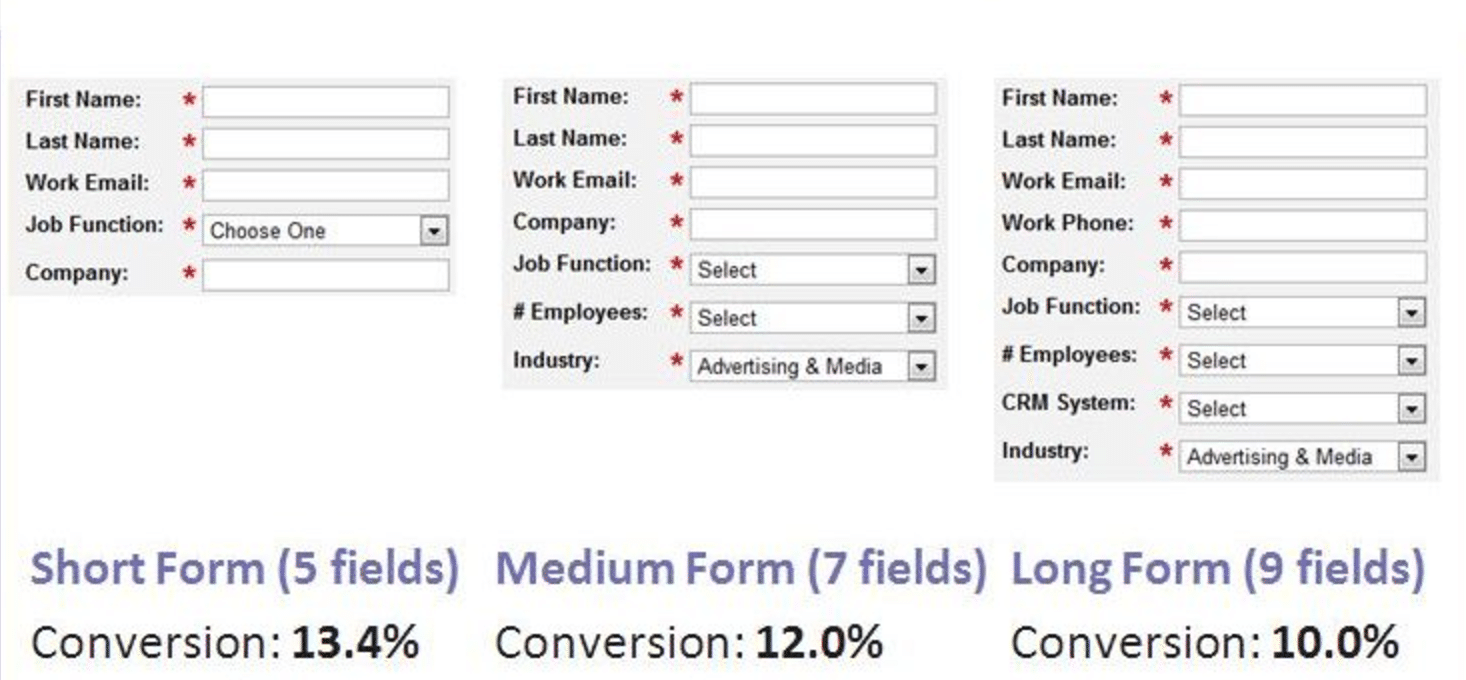
A case study from VentureHarbour reveals that a website form that has more than five form fields can negatively impact conversion rates. This case study demonstrates that when Marketo reduced the number of form fields from nine fields to five fields, conversion rates increased by 34%. That’s right! By changing nothing else on the landing page, Marketo was able to go from a 10 percent conversion rate to a 13.4 percent conversion rate.
We get it: as a B2B marketer, you want to know as much information as possible about your leads and customers so you can continue to refine your efforts. However, the studies show that this leads to lower conversion rates.

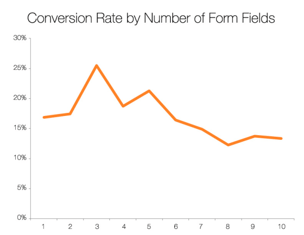
HubSpot analyzed more than 40,000 landing page forms and determined that as the number of form fields increased, the conversion rates decreased as a result.
To optimize a form, think about what information you actually need versus what you’re requesting. Of course, this all depends on what your B2B defines as a conversion. For example, if a conversion is an email signup, then a short form will do (just first name and email). On the other hand, if your definition of a conversion is a free trial of your product, you may need to ask for credit card information, a phone number to reach out and review their trial experience and a first and last name.
Key Takeaway: Create the least resistance possible between you and your buyer by simplifying the conversion process.
Conversion Optimization Tactic #5: Retargeting Your Audience (Consideration Stage)
Simply put, retargeting involves delivering personalized ads to website visitors after they’ve left your website. Retargeting is an effective way to capitalize on the leads that were thinking of your B2B offering at one point and time but weren’t quite ready to make the purchase.
SEMrush states that remarketing converts up to 50 percent of traffic while search campaigns convert approximately two percent.

There are also all kinds of ways to retarget your audience that are especially effective for B2B organizations. For example, if you’re offering a free product or trial, retargeting helps covert the leads that signed up for a free trial, but did not make a purchase. Let us explain. For your retargeting audience, you can upload a list of leads that went through a free trial but did not convert to a customer.
We know this audience already has a high intent to make a purchase since they have signed up for a free trial. After seeing your brand (and possibly a new offer, like offering a limited time 10% off) they may reconsider. Retargeting to this audience will remind them to take the necessary steps to sign-up for your paid service offering and give them a new incentive to do so.
Here are three best practices to keep in mind when designing a remarketing campaign:
- Tweak the landing page: Create a unique landing page specifically for your remarketing campaign. As we discussed, make it hyper-targeted to this audience. You can also consider running a promotion that boosts their incentive to convert.
- A/B test: If you’re spending your marketing budget on remarketing, make sure you make the most of it. Create A/B tests to test every element in the ad, including the ad images, copy, display link and descriptions, to maximize the return-on-investment.
- Refine your targeting: you can set up all types of parameters to narrow down your audience and maximize engagement, such as excluding visitors who have bounced or have spent less than 10 seconds on your site.
Ready to Maximize Conversions for Your B2B Organization?
As you can see, a lot goes into optimizing your B2B website for conversions, but the result is well worth it. The takeaway here is that once you build it, they won’t always come. You have to conduct many optimization tweaks and tests to determine what works the best for your B2B niche. Contact us for a B2B website consultation to see how we can help.
Learn more about how to build a successful campaign that drives conversions.
