If your business has been holding back on initiating a website redesign due to cost concerns, be...

Business Tax Deductions: How A Website Redesign Could Save You Money
read more


Stay ahead with expert insights and practical tips for enhancing your website, SEO, and all things digital marketing.
All
Digital Marketing
Web Design
Inbound Marketing
SEO
Homebuilders
B2B
Lasso Up News
If your business has been holding back on initiating a website redesign due to cost concerns, be...
Your company website is more than just an online presence—it’s a critical tool for your business’s...
If your website were a person, would it still be rocking...
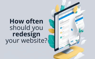
The simplest answer to how often you should redesign your website is this: as often as it needs...
If you’re thinking about approaching a new website design project for your company, it’s hard to...
Your website is your most important sales tool and the cornerstone of all your marketing efforts....

Nothing in web design should happen by accident. To put that another way, every web design choice...

Find Web Design Inspiration Resources for your website redesign project. Look and feel, navigation, layout and messaging ideas.

One day you take a good look at your website and realize it’s seriously out of date. Its...